Build smarter, ship faster, and stand out from the crowd.
Subscribe or follow on X for updates when new posts go live.
How One JavaScript Engineer Helped Prevent Dozens of Misfiled Bug Reports
The Silent Blame Game
It always starts the same way.
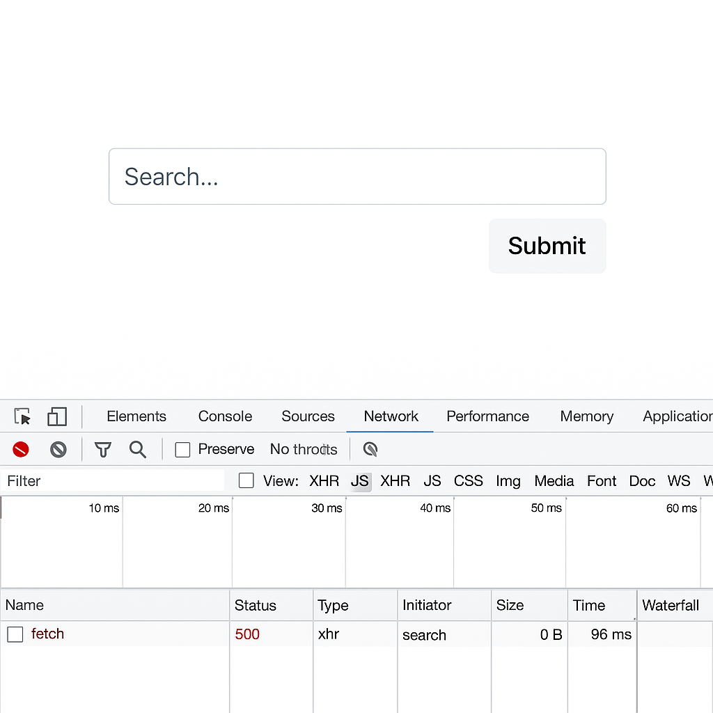
A user clicks a button—maybe “Submit” or “Search”—and nothing happens. Or worse, a vague “Something went wrong” message appears with no details. A bug is filed. QA reproduces it inconsistently. Product’s frustrated. And somewhere down the thread, the frontend engineer gets tagged:
Hey, can you look into this? The UI seems broken.
That engineer was Alex—a JavaScript developer supporting a fast-moving internal platform. Alex kept getting pulled into incidents that weren’t actually caused by frontend code. The root issue? A backend API failure. One that returned a valid HTTP response… with a perfectly good stack trace and message in the body. But unless you were watching the network tab in DevTools—or digging through logs hours later—no one saw it.
The data existed. It just wasn’t visible in the moment.
Alex realized the product lacked something critical: a way to make API failures immediately visible to the right people. If those error payloads—status codes, messages, stack traces—were surfaced inside the UI at the time of failure, engineers could triage faster, assign ownership accurately, and avoid wasting time pointing fingers.
Something had to change. And it started with how errors showed up—right after a button was clicked.
The Repeating Problem: API Failures Hidden Behind Silence
This wasn’t a one-off.
In modern single-page apps, almost every button, input, or modal triggers an API call. When those calls succeed, the UI updates and everyone moves on. But when they fail—especially with a 500 or 422 error—there’s often no visual indication of what went wrong. The fetch fails quietly. A toast might appear. Or not. The UI might freeze, or just reset.
To the user, “the button didn’t work.”
QA logs a bug. Product asks if it’s frontend. Engineers guess. Meanwhile, the real error—the status code, the backend’s message, even a stack trace—is all right there… buried inside the response in the browser’s network tab. But unless someone knows where to look—and that’s a big unless—it’s as if the failure never happened.
There’s rarely enough context to understand the issue: Which endpoint failed? What data was sent? What triggered it? What did the backend say in response?
The truth is, the debugging information is often hiding in plain sight. But users, QA, and even product managers aren't equipped—or expected—to dig into browser tools. And so, the frontend gets the bug, the backend stays invisible, and the cycle repeats.
The Breakthrough: A Frontend-First Pattern for Debugging Transparency
After one too many vague bug reports, Alex had an idea: what if the debugging tools engineers rely on could be part of the actual product UI?
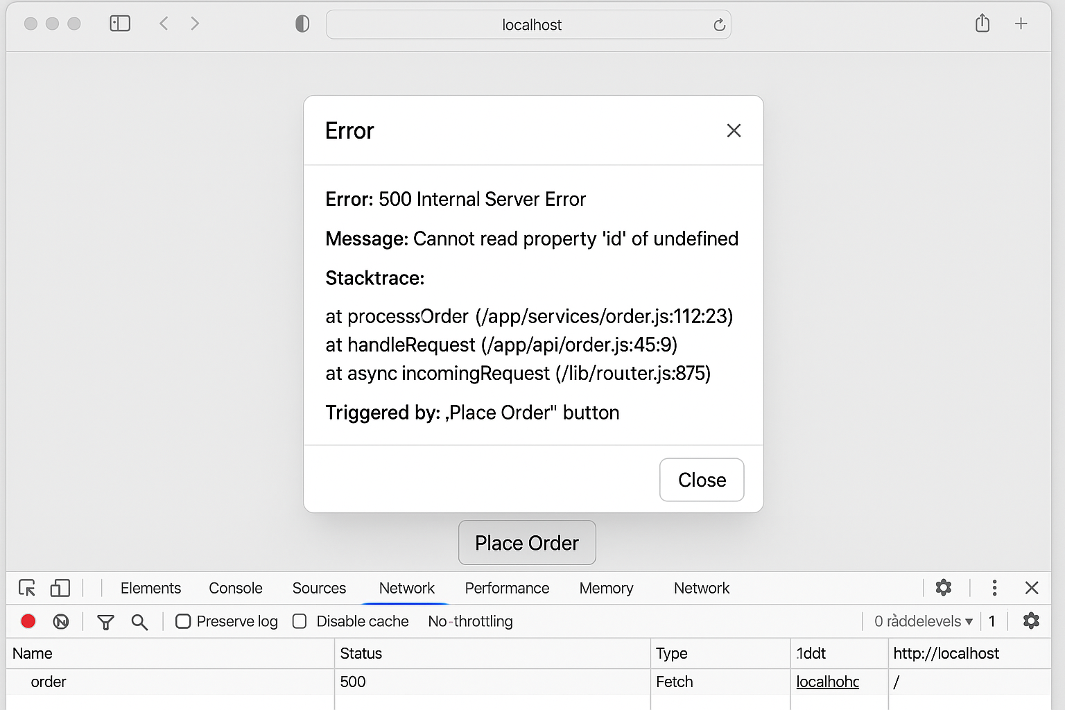
Instead of leaving error context buried in the browser’s network tab—or lost in a backend log stream—Alex built a UI-native error modal. It was lightweight, unobtrusive, and designed to surface failures right when and where they happened.
The logic was simple: any time a fetch call failed (non-2xx status), the modal would trigger.
The modal included:
- 🧾 The HTTP status code
- 💬 The backend’s error message (if available)
- 🧠 A frontend-side stacktrace to show what triggered the request
- 🖱 Optionally, the user interaction that caused it—like the button label or autocomplete input
Instead of relying on QA to spot vague issues or engineers to grep logs hours later, the modal gave teams what they needed instantly. QA could take a screenshot. PMs could understand the context. And backend engineers could trace it all back to their endpoint, message, and even server-side code path.
This wasn’t just a tool for debugging. It was a lens into the system, shared across teams.
Alex wasn’t trying to offload blame—just give everyone better visibility.
The modal became more than a UI element. It became the missing link between systems and teams.
Implementation Walkthrough
With the error modal concept taking shape, the next challenge was making it consistent, maintainable, and easy to integrate across the app. Alex didn’t want every developer on the team to rewrite their own error handling logic for each request—or worse, forget to do it at all.
So, they reached for a pattern: treat error reporting like a platform concern, not a per-component detail.
The solution started with centralization. All API requests were funneled through a single wrapper—a fetch helper that would catch failed responses and surface them to the modal automatically. This allowed the modal to become a first-class part of the user experience, rather than an afterthought that relied on developers to manually hook it up.
Behind the scenes, the wrapper collected not just the status and message, but also additional context—what triggered the call. Whether it was a button click, an autocomplete submission, or a tab switch, this context helped explain what the user was trying to do when the failure occurred.
To keep the UI flexible across environments, the modal also respected verbosity settings. In development or staging, it could display detailed stack traces and context objects, allowing engineers to debug freely. But in production, those details could be suppressed—or gated behind a developer-only toggle—ensuring that error reporting never compromised UX or security.
This approach also opened the door to extensibility. The modal could be wired into a global context or even caught by an error boundary in React or similar frameworks, ensuring it worked uniformly across the app. No more one-off handlers or inconsistent fallback UIs. The system treated errors as a shared concern—just like loading states or authentication.
Alex’s implementation wasn’t flashy. It was foundational.
It created a culture of visibility, not just resilience. And it gave every engineer on the team a common language for failure—one that surfaced at the exact moment it was needed.
To make this pattern easy to adopt across the codebase, Alex implemented a reusable fetchWithModal helper. It wraps a standard fetch call, handles response validation, and triggers the error modal with rich context when something goes wrong. Here's what that core function looks like:
export async function fetchWithModal(url, opts, contextInfo) {
    try {
        const res = await fetch(url, opts)
        if (!res.ok) {
            const errorPayload = await res.json()
            throw {
            status: res.status,
            message: errorPayload?.message || 'Unknown error',
            context: contextInfo,
            }
        }
        return res.json()
    } catch (err) {
        showErrorModal(err)
        throw err // bubble up if needed
    }
}
Calling this function is just as simple. Developers only need to pass in the endpoint, request options, and a small context object that describes the user interaction. Here’s how it might be used inside a button click handler:
async function handleSubmit() {
  const contextInfo = {
    action: 'Submit Order',
    component: 'CheckoutForm',
    payload: { itemId: 42, quantity: 1 }
  }

  try {
    await fetchWithModal('/api/order', {
      method: 'POST',
      headers: { 'Content-Type': 'application/json' },
      body: JSON.stringify(contextInfo.payload)
    }, contextInfo)
  } catch (err) {
    // Error modal handles display; optional fallback logic here
  }
}
This approach allowed engineers to enrich error context without duplicating logic or needing deep knowledge of how the modal worked. It became a drop-in safety net for any network call.
The Ripple Effects: How This Helped Every Team
Alex’s error modal didn’t just help engineers. It quietly transformed the way multiple teams worked together.
🧑💻 For Developers
Bug triage stopped feeling like guesswork. With detailed errors shown directly in the UI, developers could reproduce issues with confidence. They no longer had to ask QA for videos or hope someone had the console open. The HTTP status, backend message, and triggering UI action were all immediately visible. Fixes happened faster, and with fewer round trips between teams.
🧪 For QA
Quality assurance engineers now had a new tool in their toolbox: the screenshot. Every time the error modal appeared, they could capture it and attach it to a ticket. That one image—containing the stack trace, message, and context—answered the most important debugging questions without a back-and-forth Slack thread. Was it frontend? Was it backend? The answer was usually obvious.
🧠 For Product Managers
Product managers noticed the shift almost immediately. Developers were no longer chasing ghost bugs or needing grooming meetings to decipher vague Jira tickets. Now, every issue came with a clear signal and a breadcrumb trail. Engineers could move from report to resolution without needing a full user replay. Dev cycles tightened. Confidence in releases improved. And product conversations shifted from “What happened?” to “What should we do next?”
What started as a frontend pattern became a cross-team accelerator—just by making the invisible visible.
Better Together: Cross-Team Visibility
At first, the error modal was built to make the frontend team’s life easier. But it quickly became something more.
It created empathy.
Instead of throwing errors into a console or leaving them buried in logs, the modal surfaced backend stack traces and messages in a way everyone could see. QA began including modal screenshots in every bug report—not just for the frontend team, but for backend engineers as well. And the response from those backend engineers was surprising: they welcomed it.
They could finally see their own failures rendered in real-time context. No more vague summaries like "the button didn’t work." Now it was: “500 from /api/order triggered by the Place Order button, with this stack trace.” It was all right there—no need to dig through logs or guess at user behavior.
The frontend stopped being a mystery. The backend stopped being a black box. Everyone was working from the same source of truth.
And instead of finger-pointing during bug triage or retro, teams were aligned. They could focus on fixing problems, not proving where they came from.
What began as a UI pattern turned into a culture shift—one driven by transparency, not tooling.
Beyond Debugging: Designing for Quality at the UI Layer
Alex’s solution didn’t just patch a developer pain point—it redefined the role of the frontend in the system as a whole.
Traditionally, the UI is treated as a consumer of backend services. It makes requests, renders data, and reacts to success or failure. But with the error modal in place, the frontend became something more: a participant in system observability.
Errors weren’t hidden anymore. They were framed, contextualized, and communicated—at the exact moment they occurred. This gave every team member—from engineers to QA to product—a shared vantage point.
Importantly, this wasn’t about blaming the backend or exposing internal stack traces for show. It was about accountability and empowerment. About giving teams better visibility so they could move faster and fix issues sooner.
The error modal didn’t just catch failures. It invited the entire team to learn from them—and build better, together.
Closing: The Modal That Changed the Culture
Alex didn’t wait for permission.
He didn’t open a ticket. He didn’t ask for a cross-team initiative. He just saw a pattern—opaque errors, misdirected bugs, endless back-and-forth—and decided to fix it.
By turning a silent failure into a visible, shareable moment, Alex gave every team better clarity, faster feedback, and fewer misfires. What started as a small UI modal ended up changing the way engineering, QA, and product collaborated.
If you're a frontend engineer tired of being the default fallback for unknown bugs, this is your invitation.
You don’t have to rewrite the stack to improve how your team works. Sometimes, the right modal at the right moment is enough to move the needle.
Because your work doesn’t just ship pixels.
It can shape how problems are understood. How teams align. And how quality becomes everyone’s job.